Is Your Banner Image Too Wide?
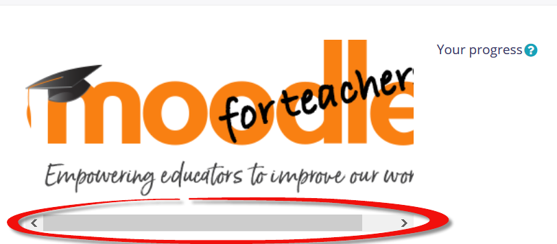
When you insert an image into a textbox in your course, sometimes the image is too wide to display in the space available. In that case, you'll end up with a horizontal scroll bar that allows you to navigate the entire width of the image. There's an easy way to adjust your settings so that the entire image will be displayed without a scroll bar -- on any device!
Here's an extra wide image from Twahir's 3.7 practice course with its scroll bar:

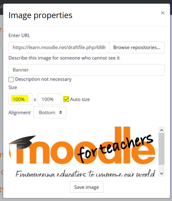
To fix it, click on the image to adjust the settings. Change the width dimension to 100% and make sure that Auto size is checked:

Save the image and check out how nicely it now fits on the page
No more scroll bar! And your image will look great regardless of the size of the screen your learners are using.
Bonus tip! If you add a border to an image (an option if you are using TinyMCE as your editor), resize your image to no more than 98% -- otherwise, the border will make your image 102% wide and display the horizontal scroll bar again.
Learning to use percentages instead of pixels with images is the number one trick I've learned through Learn Moodle and I use it nearly every day! I'm happy to share it with all of you.
Happy Moodling! Let's share some beautiful images! (Or silly ones -- whatever works!)

Virtual Academy of Teaching and Learning
Contact
E-mail: vatl@ysu.am
Phone: (+374 10) 57 06 77